Technical guide
How to prepare artwork for large-format printing
Correct dimensions, a print-ready PDF, CMYK colours, suitable image resolution and safe margins help prevent delays and unexpected results.
Published 19 July 2026 · drukwroclaw.pl
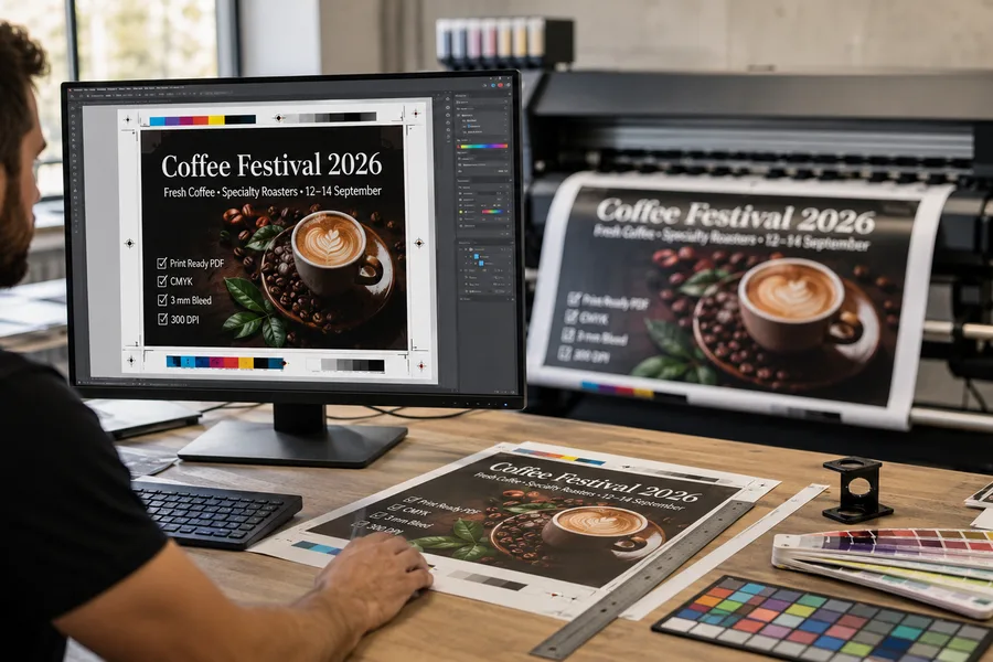
Preflight checklist
- ✓ Correct dimensions and proportions
- ✓ Print-ready PDF
- ✓ CMYK colour mode
- ✓ Suitable image resolution
- ✓ Fonts outlined or embedded
- ✓ Safe distance from edges
- ✓ Spelling and contact details checked
- ✓ Finishing method specified
Set the correct dimensions and proportions
Start with the final product size. Artwork for a 300 × 100 cm <Link href="/en/products/banners/">banner</Link> must have a 3:1 aspect ratio. A square image cannot fill that area without cropping, adding background or distortion.
Work at 1:1 whenever possible. For exceptionally large files, a clearly stated 1:10 scale can be used. Remember that effective image resolution is reduced when the file is enlarged to final size.
Use a print-ready PDF
PDF preserves page dimensions, vector artwork, layout and embedded fonts. It is safer than sending an editable design file with missing linked images or typefaces.
Open the exported PDF before sending it. Verify the page size, all text, transparency, images and the number of pages. Use a descriptive filename containing the product dimensions and quantity.
Prepare colours in CMYK
Screens display RGB light, while printing uses CMYK inks. Bright screen colours, especially vivid greens and blues, may appear more muted in print.
Working in CMYK from the start gives a more realistic preview. For colour-critical brand work, provide colour values and discuss a printed proof rather than using a phone screen as the reference.
Match resolution to viewing distance
Large-format print does not always require 300 ppi. A <Link href="/en/products/banners/">banner</Link> viewed from several metres needs less detail than a <Link href="/en/products/posters/">poster</Link> or sticker examined at arm's length.
Around 100–150 ppi at final size is often sufficient for normal banners. Enlarging a small image does not create missing detail; blurred or heavily compressed source files remain poor after scaling.
Allow for finishing
Keep logos, phone numbers and QR codes away from hems, eyelets, seams and pole pockets. Finishing can cover or distort elements positioned too close to the edge.
Bleed requirements depend on the product. Do not guess if no specification is available. Confirm the required bleed and safe area before exporting the final artwork.
Outline fonts and check small elements
Outlining text prevents font substitution and layout changes. Keep an editable copy before converting text to curves.
Very thin lines, tiny text and low-contrast QR codes can fail in production or become unreadable at the intended viewing distance. Test the hierarchy at a reduced on-screen size and verify all contact details.
Common artwork errors
- • Artwork proportions do not match the order
- • Low-resolution images enlarged to several metres
- • RGB files with unverified colour conversion
- • Text placed inside finishing areas
- • Missing or non-embedded fonts
- • Unclear filenames for multiple versions
Not sure if your file is ready to print? Send it to us — we'll check it before production.
FAQ — print artwork
What file format is best?
A print-ready PDF is the safest choice because it preserves dimensions, vector objects and embedded fonts.
Must artwork be created at 1:1?
Preferably yes. A clearly identified 1:10 scale is acceptable for exceptionally large designs.
What resolution is required?
It depends on viewing distance. Normal banners often work well at roughly 100–150 ppi at final size, while close-viewed products require more detail.
Should I use RGB or CMYK?
Use CMYK. Automatic RGB conversion can change the appearance of bright screen colours.
Should fonts be outlined?
Yes. Alternatively, every font must be correctly embedded in the PDF.
Choose a product and calculate the price
When the artwork is ready, open the relevant product calculator. Net amount, VAT, gross amount and courier delivery are shown separately.